A tool that helps people reflect on their daily life in a fun and simple way. It encourages users to write about their thoughts and feelings, whether it’s for capturing happy memories or expressing emotions during tough times.

Date
FEB 1, 2025 — JUN 6, 2025
ROLE
UX/UI DESIGNER
SERVICES
DIGITAL PLATFORM
About the project
Saon is a journaling app designed to help users reflect on their daily lives through a simple and supportive experience. The project started from user research and concept development, and was later turned into a working prototype.
It was developed as part of a team project during my exchange program in the Netherlands, where I collaborated closely with a Dutch teammate from different backgrounds. I was responsible for UX/UI part, with my work later handed over for development.
User Research & Personas
I conducted surveys and interviews with people interested in journaling to better understand their needs and struggles. Many shared that they often felt unmotivated, inconsistent, or unsure how to express their thoughts. From these insights, I created personas that represent different journaling styles and emotional needs, which helped guide the design throughout the process.


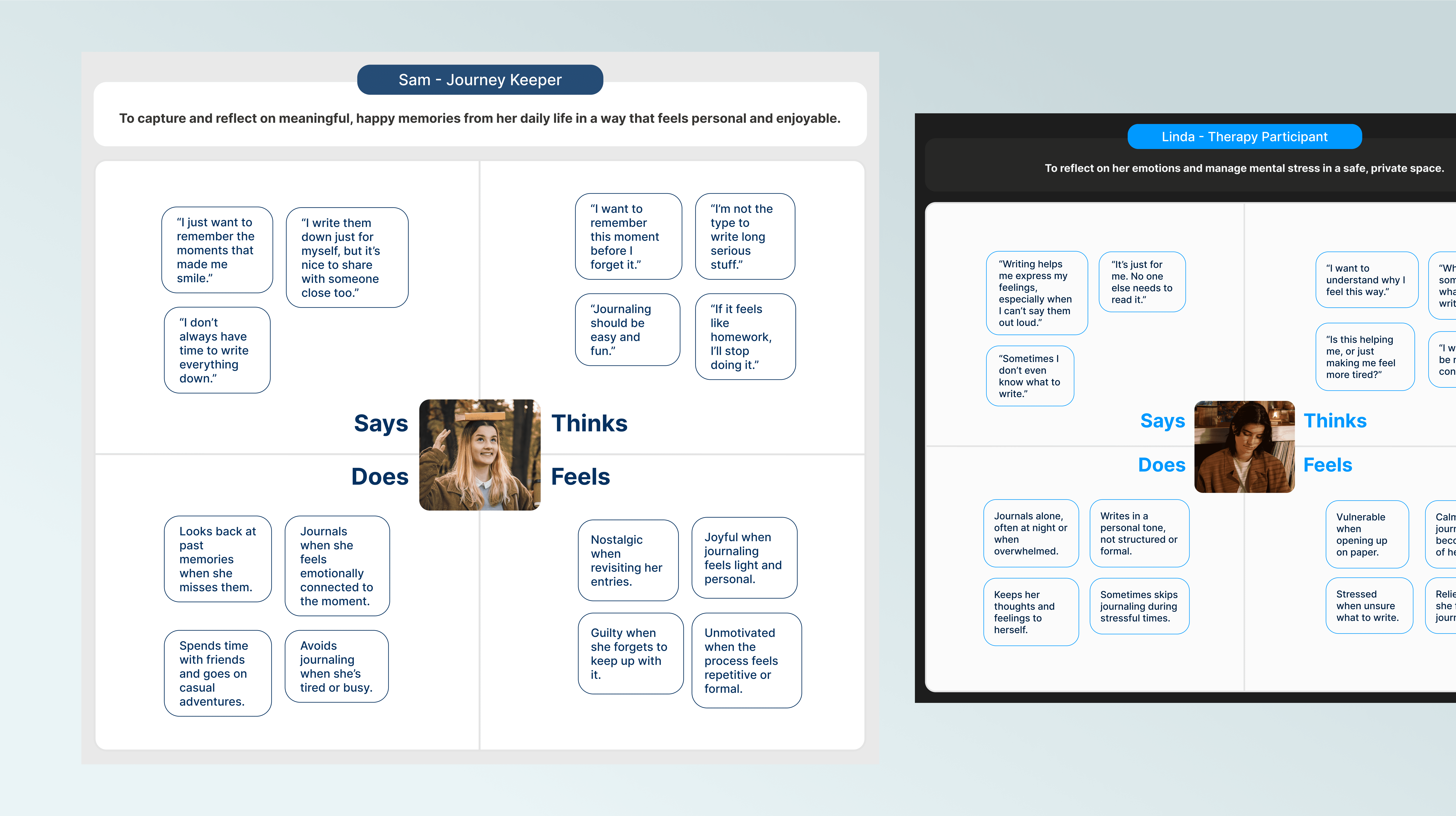
Empathy Map & User Journey
Creating empathy maps and user journeys helped me better understand what users think, feel, and do during different moments in their day. I focused on identifying emotionally sensitive points where users may need more support and clarity.
This process allowed me to visualize the user flow and uncover key pain points and needs. These insights played an important role in shaping the design direction and prioritizing features that reflect real-life behaviors and context.

Feature
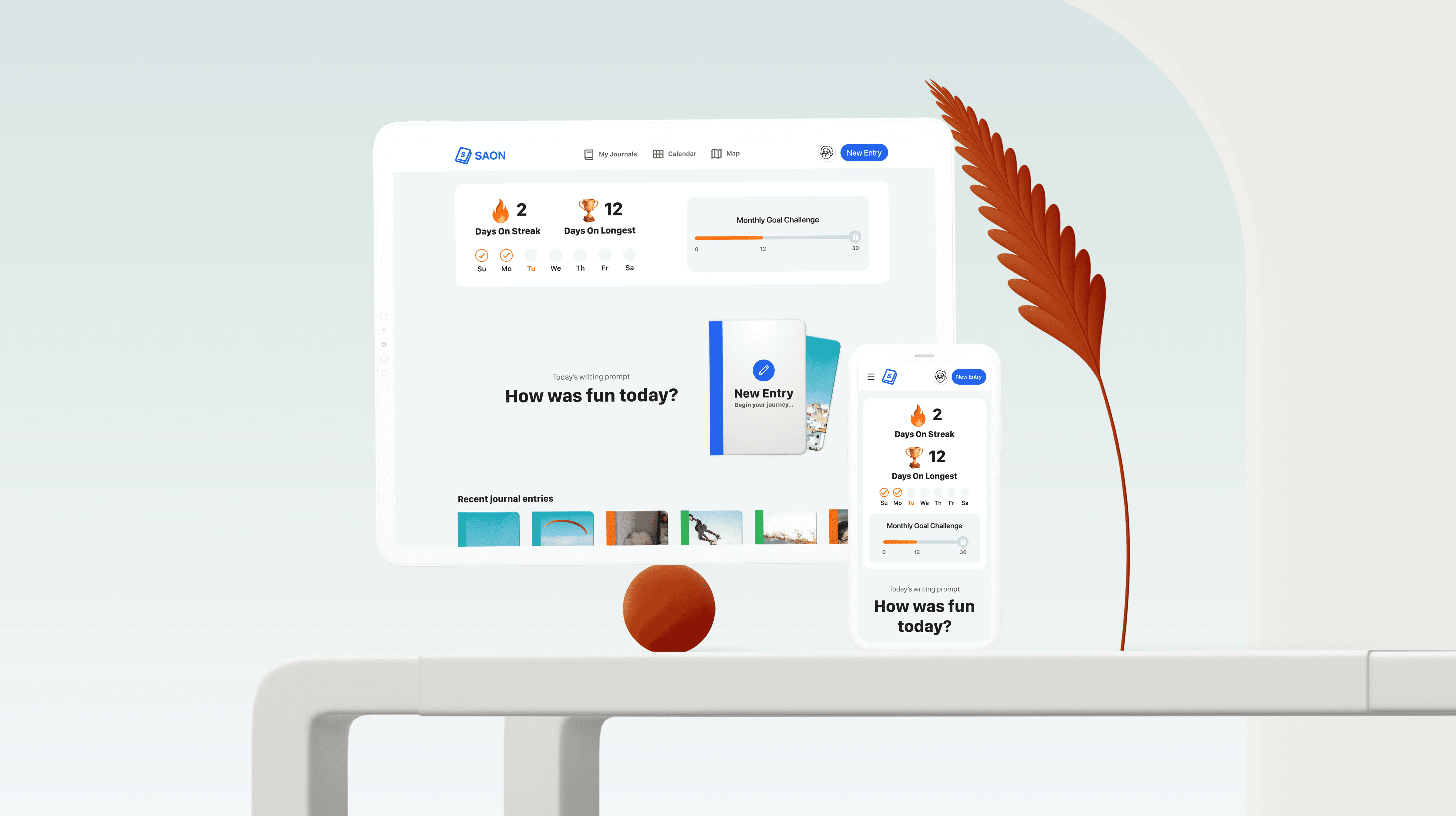
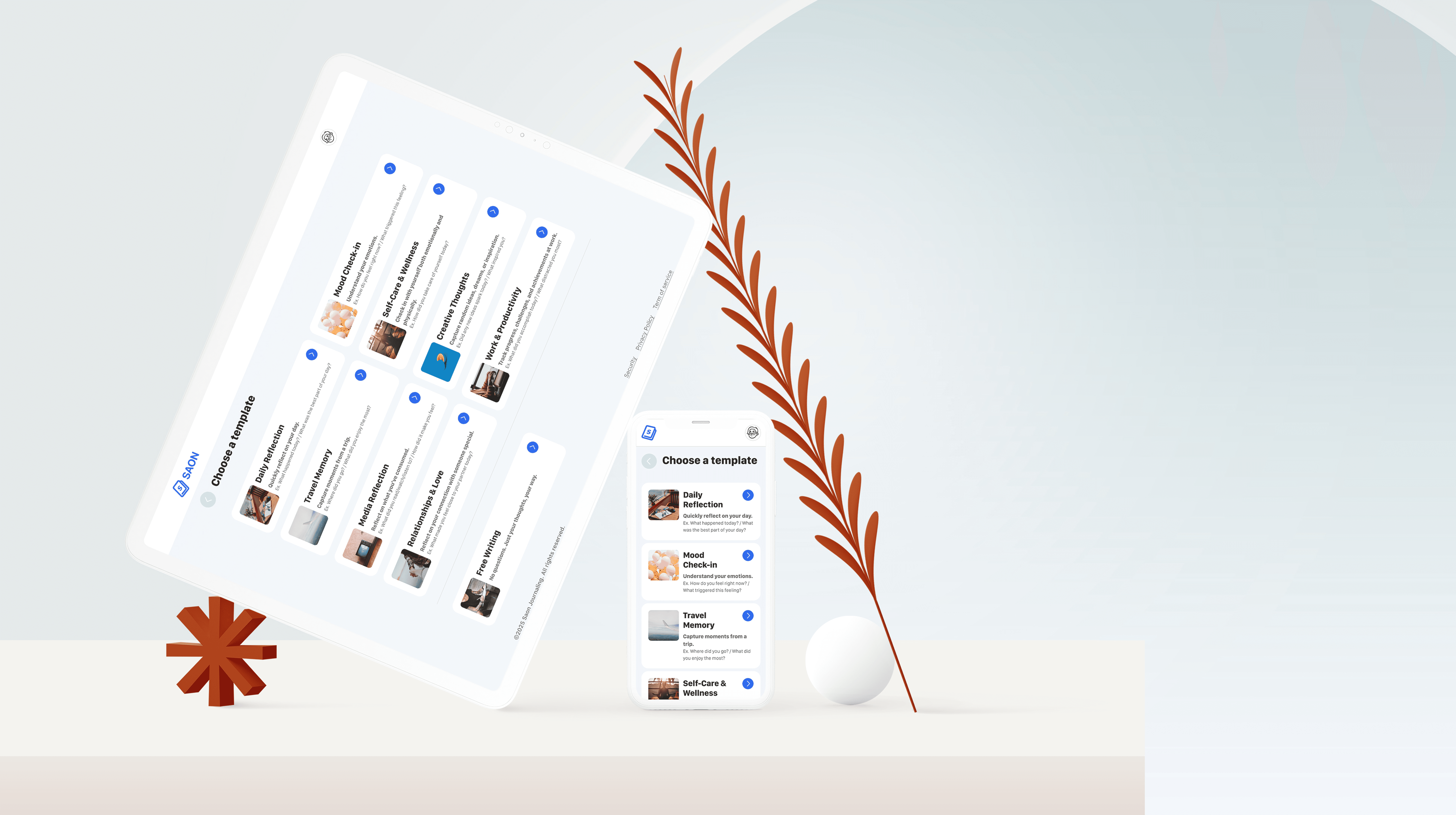
Insights from empathy maps and user journeys helped define features that support both casual and emotional journaling. Users can write freely or use guided templates, add mood tags, media, location, and weather. Collaboration was also included, allowing users to safely share entries with trusted people. These features were prioritized for this sprint to create a strong foundation. Additional ideas generated through the HMW process were kept in the backlog for future development.

Information Architecture
& Wireframe
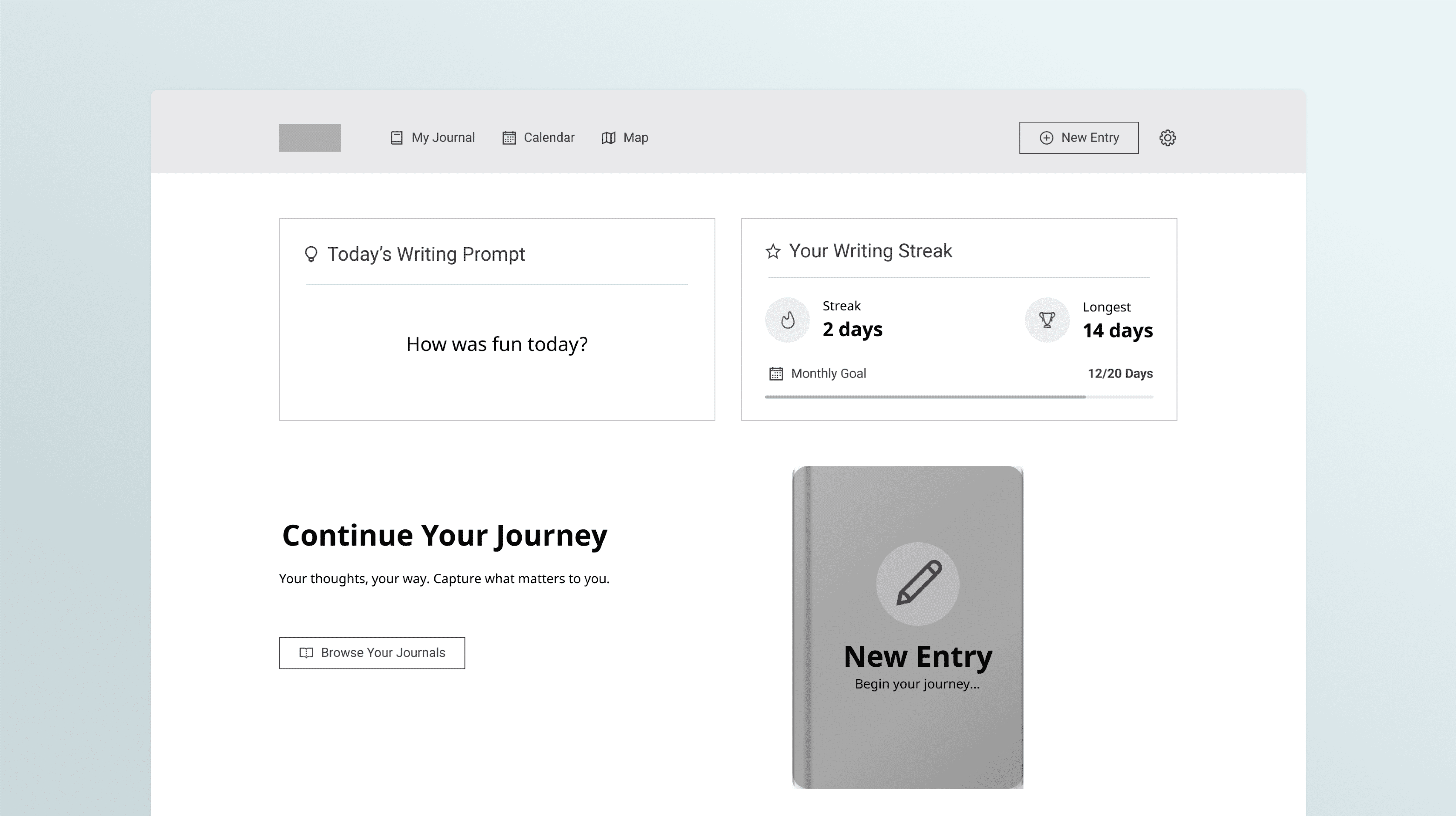
I created the information architecture and mid-fidelity wireframes to shape a clear and intuitive user flow. The structure allows users to start journaling, use templates, or revisit past entries through calendar and map views. Each screen was designed to reflect the emotional journey of the user, making the overall experience smooth and supportive.

Usability Test
To validate the design, I conducted usability tests with users who matched our target personas. They were asked to complete tasks such as writing a journal, using a template, and finding past entries. Most participants found the prototype easy to use and emotionally supportive. Some pointed out areas to improve, including emotion selection, icon clarity, and layout adjustments. I used this feedback to refine the next version and better match user expectations.

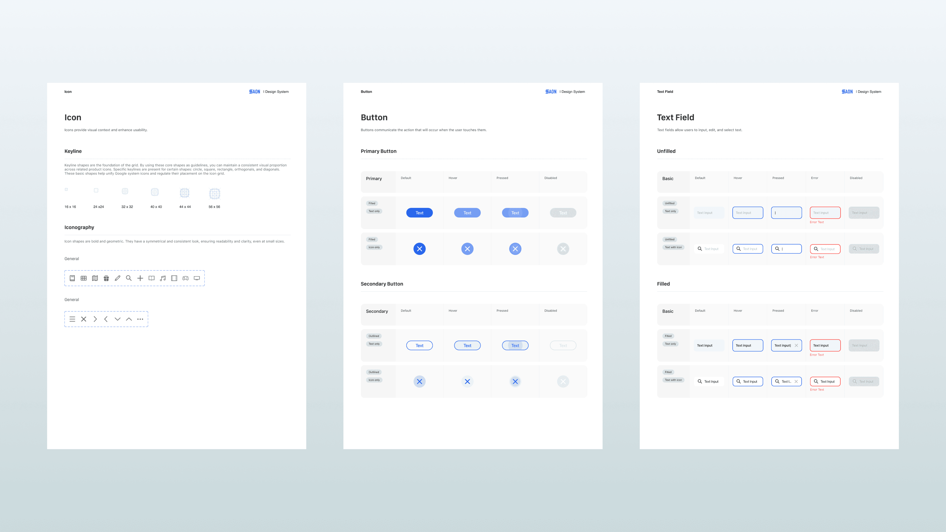
Design System
After testing, I refined the design based on user feedback and built a consistent design system for developer handoff. I documented all components and UI patterns to ensure clarity and alignment. This helped bridge the gap between design and development, keeping the final product true to the intended user experience.
Outcome


Smooth Scroll
This will hide itself!
This will hide itself!
Saon – A journaling platform
OVERVIEW
A tool that helps people reflect on their daily life in a fun and simple way. It encourages users to write about their thoughts and feelings, whether it’s for capturing happy memories or expressing emotions during tough times.
Date
FEB 1, 2025 — JUN 6, 2025
ROLE
UX/UI DESIGNER
SERVICES
DIGITAL PLATFORM
About the project
Saon is a journaling app designed to help users reflect on their daily lives through a simple and supportive experience. The project started from user research and concept development, and was later turned into a working prototype.
It was developed as part of a team project during my exchange program in the Netherlands, where I collaborated closely with a Dutch teammate from different backgrounds. I was responsible for UX/UI part, with my work later handed over for development.
User Research & Personas
I conducted surveys and interviews with people interested in journaling to better understand their needs and struggles. Many shared that they often felt unmotivated, inconsistent, or unsure how to express their thoughts. From these insights, I created personas that represent different journaling styles and emotional needs, which helped guide the design throughout the process.
Empathy Map & User Journey
Creating empathy maps and user journeys helped me better understand what users think, feel, and do during different moments in their day. I focused on identifying emotionally sensitive points where users may need more support and clarity.
This process allowed me to visualize the user flow and uncover key pain points and needs. These insights played an important role in shaping the design direction and prioritizing features that reflect real-life behaviors and context.
Feature
Insights from empathy maps and user journeys helped define features that support both casual and emotional journaling. Users can write freely or use guided templates, add mood tags, media, location, and weather. Collaboration was also included, allowing users to safely share entries with trusted people. These features were prioritized for this sprint to create a strong foundation. Additional ideas generated through the HMW process were kept in the backlog for future development.
Information Architecture
& Wireframe
I created the information architecture and mid-fidelity wireframes to shape a clear and intuitive user flow. The structure allows users to start journaling, use templates, or revisit past entries through calendar and map views. Each screen was designed to reflect the emotional journey of the user, making the overall experience smooth and supportive.
Usability Test
To validate the design, I conducted usability tests with users who matched our target personas. They were asked to complete tasks such as writing a journal, using a template, and finding past entries. Most participants found the prototype easy to use and emotionally supportive. Some pointed out areas to improve, including emotion selection, icon clarity, and layout adjustments. I used this feedback to refine the next version and better match user expectations.
Design System
After testing, I refined the design based on user feedback and built a consistent design system for developer handoff. I documented all components and UI patterns to ensure clarity and alignment. This helped bridge the gap between design and development, keeping the final product true to the intended user experience.
Outcome
Smooth Scroll
This will hide itself!
This will hide itself!
Saon – A journaling platform
OVERVIEW
A tool that helps people reflect on their daily life in a fun and simple way. It encourages users to write about their thoughts and feelings, whether it’s for capturing happy memories or expressing emotions during tough times.
Date
SEP 6, 2023
— NOV 29, 2023
ROLE
UX/UI DESIGNER
SERVICES
DIGITAL PLATFORM
About the project
Saon is a journaling app designed to help users reflect on their daily lives through a simple and supportive experience. The project started from user research and concept development, and was later turned into a working prototype.
It was developed as part of a team project during my exchange program in the Netherlands, where I collaborated closely with a Dutch teammate from different backgrounds. I was responsible for UX/UI part, with my work later handed over for development.
User Research & Personas
I conducted surveys and interviews with people interested in journaling to better understand their needs and struggles. Many shared that they often felt unmotivated, inconsistent, or unsure how to express their thoughts. From these insights, I created personas that represent different journaling styles and emotional needs, which helped guide the design throughout the process.
Empathy Map & User Journey
Creating empathy maps and user journeys helped me better understand what users think, feel, and do during different moments in their day. I focused on identifying emotionally sensitive points where users may need more support and clarity.
This process allowed me to visualize the user flow and uncover key pain points and needs. These insights played an important role in shaping the design direction and prioritizing features that reflect real-life behaviors and context.
Feature
Insights from empathy maps and user journeys helped define features that support both casual and emotional journaling. Users can write freely or use guided templates, add mood tags, media, location, and weather. Collaboration was also included, allowing users to safely share entries with trusted people. These features were prioritized for this sprint to create a strong foundation. Additional ideas generated through the HMW process were kept in the backlog for future development.
Information Architecture
& Wireframe
I created the information architecture and mid-fidelity wireframes to shape a clear and intuitive user flow. The structure allows users to start journaling, use templates, or revisit past entries through calendar and map views. Each screen was designed to reflect the emotional journey of the user, making the overall experience smooth and supportive.
Usability Test
To validate the design, I conducted usability tests with users who matched our target personas. They were asked to complete tasks such as writing a journal, using a template, and finding past entries. Most participants found the prototype easy to use and emotionally supportive. Some pointed out areas to improve, including emotion selection, icon clarity, and layout adjustments. I used this feedback to refine the next version and better match user expectations.
Design System
After testing, I refined the design based on user feedback and built a consistent design system for developer handoff. I documented all components and UI patterns to ensure clarity and alignment. This helped bridge the gap between design and development, keeping the final product true to the intended user experience.
Outcome
Smooth Scroll
This will hide itself!
This will hide itself!